
Making Nice Figures (in MATLAB) - Part 3: EEG time-frequency analysis
Published:
Part Three: EEG time-frequeny analysis
Time-frequency analyses are a useful class of methods that help us to resolve changes in time-varying frequency content in our timeseries data. This approach is particularly useful in EEG analysis since we know that changes in certains bands correlate to changes in behavior. However, this post is not really about how to use time-frequency analysis for EEG data as much as its just a great example of how using proper color scaling makes a difference in what we can see in the data.
Just a quick disclaimer before we begin: I am using large chunks of code adapted from a tutorial on time-frequency analysis by Mike X Cohen. If you are interested in neural time series analysis, in particular EEG, EMG, or ECoG, I can’t recommend his book Analyzing Neural Time Series Data enough. I actually bought the hard copy myself and referenced it quite frequently when doing these types of analysis on EEG data.
The following tutorial is broken down into two main sections: (1) we will look at the time-frequency plots of some simulated data to see the effect of scaling, then (2) we will use some actual EEG data to further examine this in real data.
Simulated data
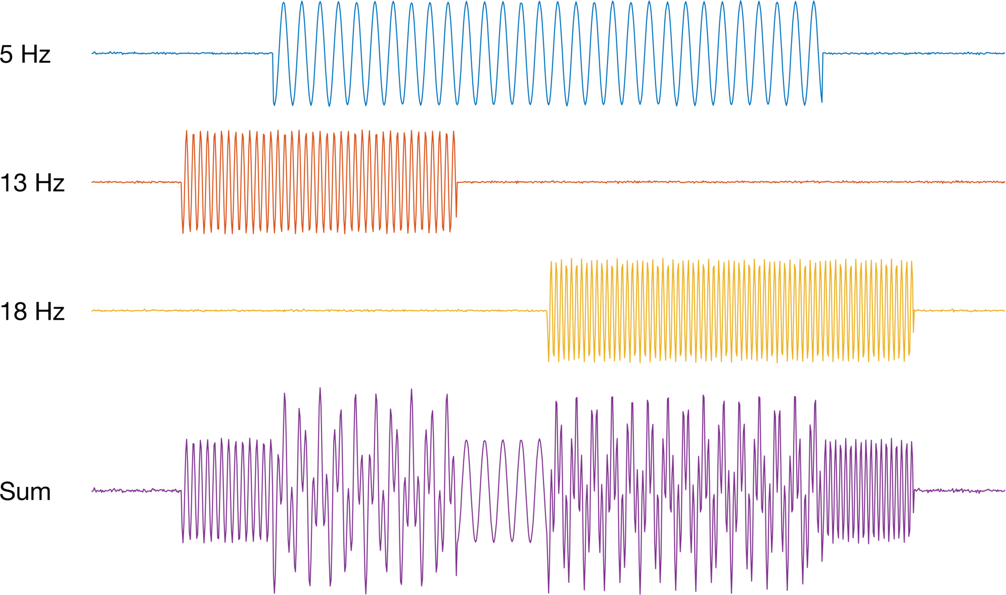
Let’s start by simulating some cosine waves, each with fixed frequency. We will also compute the sum of all of them to create a single time series with multiple frequencies.
%% %%%%%%%%%%%%%%%%%%%%%%%%%%%%%%%%%%%%%%%%%%%%%%%%%%%%%%%%%%%%%%%%%%%%%%%
%                                                                        %
%                   EXAMPLE 2: TIME FREQUENCY ANALYSIS                   %
%                                                                        %
%%%%%%%%%%%%%%%%%%%%%%%%%%%%%%%%%%%%%%%%%%%%%%%%%%%%%%%%%%%%%%%%%%%%%%%%%%

% The following code is adapted from a tutorial provided by Mike X. Cohen
% on his website. The purpose of this tutorial is to highlight the effects
% of limits and scaling on visualization of time-freq data. We will use the
% dataset and wavelet method in the original tutorial. The tutorial can be
% found here:
%
%     http://mikexcohen.com/lecturelets/whichbaseline/whichbaseline.html
%
% The data (provided by Mike) can be found here:
%
% http://mikexcohen.com/book/AnalyzingNeuralTimeSeriesData_MatlabCode.zip
%
% His book, Analzyzing Neural Time Series Data, is an excellent resource for
% anyone working on EEG analysis:
%
% https://mitpress.mit.edu/books/analyzing-neural-time-series-data
%
% Code rewritten by: Justin Brantley
% email: justin dot a dot brantley at gmail dot com

clc
clear
close all;

% Simulated data - three frequencies
fs         = 100;        % sampling rate
move_freq  = [5 13 18];  % frequencies
Tau        = 10;         % time constant
time_vec   = 0:1/fs:Tau; % time vector
amplitude  = [-1;0;1];   % Amplitude of sinewave
burst_time = [2 8;       % Busrts of sinewave
              1 4;
              5 9];

% Generate matrix of Gaussian random noise:
swave = 0.01.*randn(3,length(time_vec));
% Add sine wave to noise matrix
for ii    = 1:size(swave,1)
    xx    = burst_time(ii,1)*fs:burst_time(ii,2)*fs;
    s1    =  cos(move_freq(ii)*2*pi*time_vec(xx)+pi);
    swave(ii,xx) = swave(ii,xx) + s1;
end

% Plot sinewaves - the offsets are arbitrary and only for visualization
figure('color','w'); hold on;
plot(swave(1,:) + 2.5); text(-1*fs,2.5,'5 Hz') % 5 hz
plot(swave(2,:) + 0  ); text(-1*fs, 0 ,'13 Hz') % 13 Hz
plot(swave(3,:) - 2.5); text(-1*fs,-2.5,'18 Hz') % 18 Hz
plot(sum(swave,1) - 6); text(-1*fs,-6,'Sum') % Sum of all three

% Clean up figure
xlim([0 Tau*fs])
ylim([-9 5]);
ax        = gca;
ax.XColor = 'none';
ax.YColor = 'none';
% % If you prefer a legend:
% leg = legend({'5 Hz','13 Hz','18 Hz','Sum'});
% leg.Location = 'northoutside';
% leg.Orientation = 'horizontal';
% leg.Box = 'off';
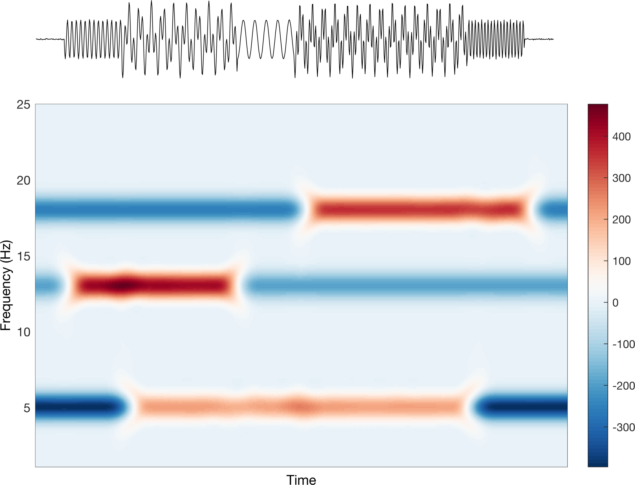
Now let’s compute the spectrogram for the summed series. We are just going to stick with the defaults on the figure. Remember, the point of this is not to better understand how time-frequency analysis works, but rather how to visualize the data for publication-ready figures.
%% Run spectogram
% Define spectrogram parameters
winSize    = fs;
winOverlap = winSize - 1;
nfft       = 1024;
minFreq    = 1;  % Min frequency for TF
maxFreq    = 25; % Max frequency for TF

% Run spectrogram
[tfmap,allfreq,time] = spectrogram(sum(swave,1),hann(winSize),winOverlap,nfft,fs,'reassign','yaxis');
freqIDX = find((allfreq<=maxFreq).*(allfreq>=minFreq));
tfmap   = tfmap(freqIDX,:);
freq    = allfreq(freqIDX);

% Plot time freq results
figure('color','w');

% Plot time series
ax1        = axes('position',[0.1 0.8 0.75 0.15]);
sumwave    = sum(swave,1);
pp         = plot(sumwave(0.5*fs:end-0.5*fs),'k'); xlim([0 length(pp.XData)]);
ax1.XColor = 'none';
ax1.YColor = 'none';

% Plot time freq
ax2 = axes('position',[0.1 0.05 0.77 0.7]);
ss  = surface(1:size(tfmap,2),freq,(abs(tfmap).^2)); ss.EdgeColor= 'none';

% Clean up
ax2.XTick         = [];
ax2.YLabel.String = 'Frequency (Hz)';
ax2.XLabel.String = 'Time';
ax2.Box           = 'on';
ax2.XLim          = [1 size(tfmap,2)];
ax2.YLim          = [minFreq+.1 maxFreq];

% Color bar
cc = colorbar;
cc.Position(1) = .9;
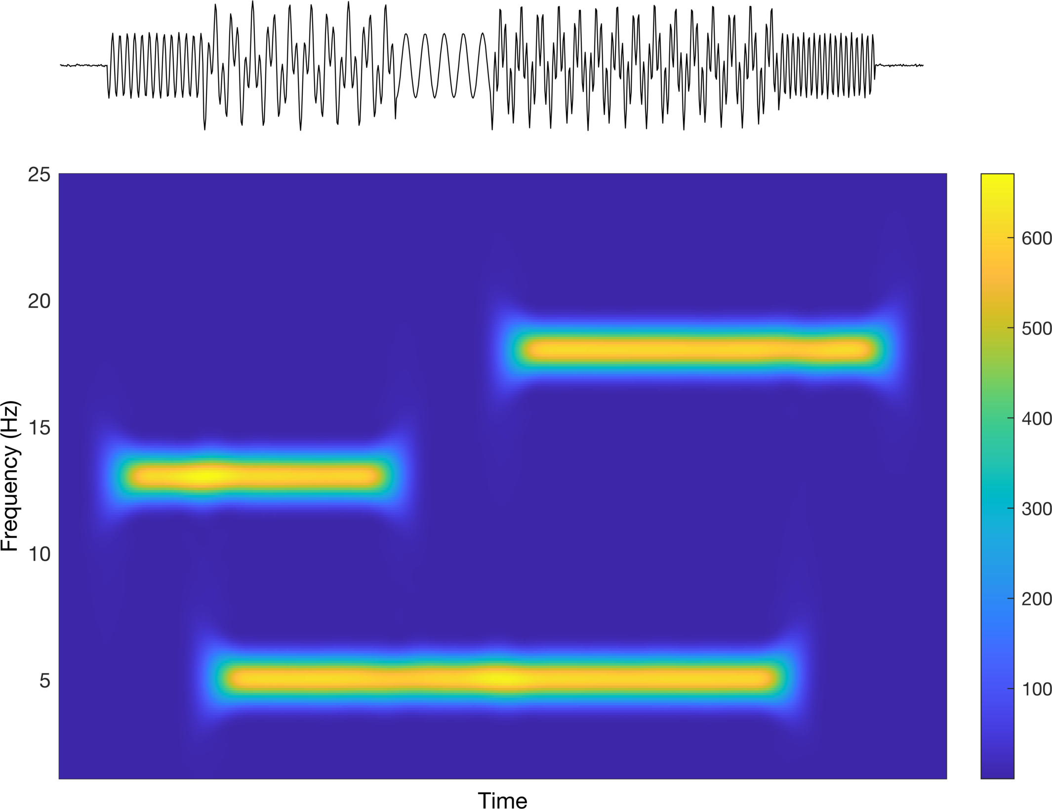
Interesting! We can see that we are able to identify our individual time-series based on the frequency (y-axis) and the time (x-axis). But again, this is about how we present it, so let’s see what we can do to make it better. The colors being used are difficult to interpret in the sense that it is not really a true divergent map nor is it a single sequential color. Let’s first try a divergent map to see how that looks.
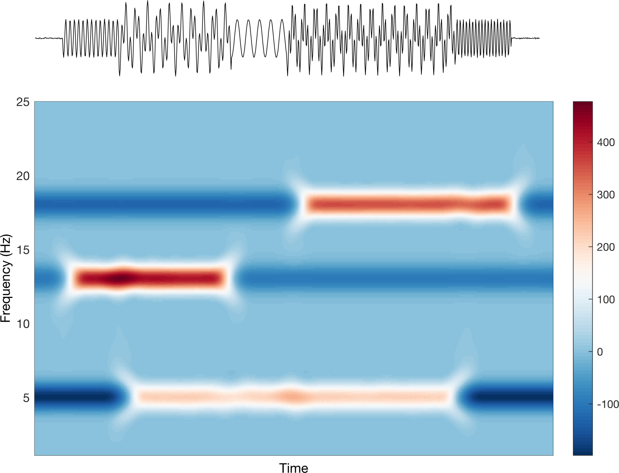
%% Change color - using divergent from before
colorscale = flipud(cbrewer('div','RdBu',100));
colorscale(colorscale < 0) = 0; % bug: sometimes produces (-) values so set to 0
ax2.Colormap = colorscale;
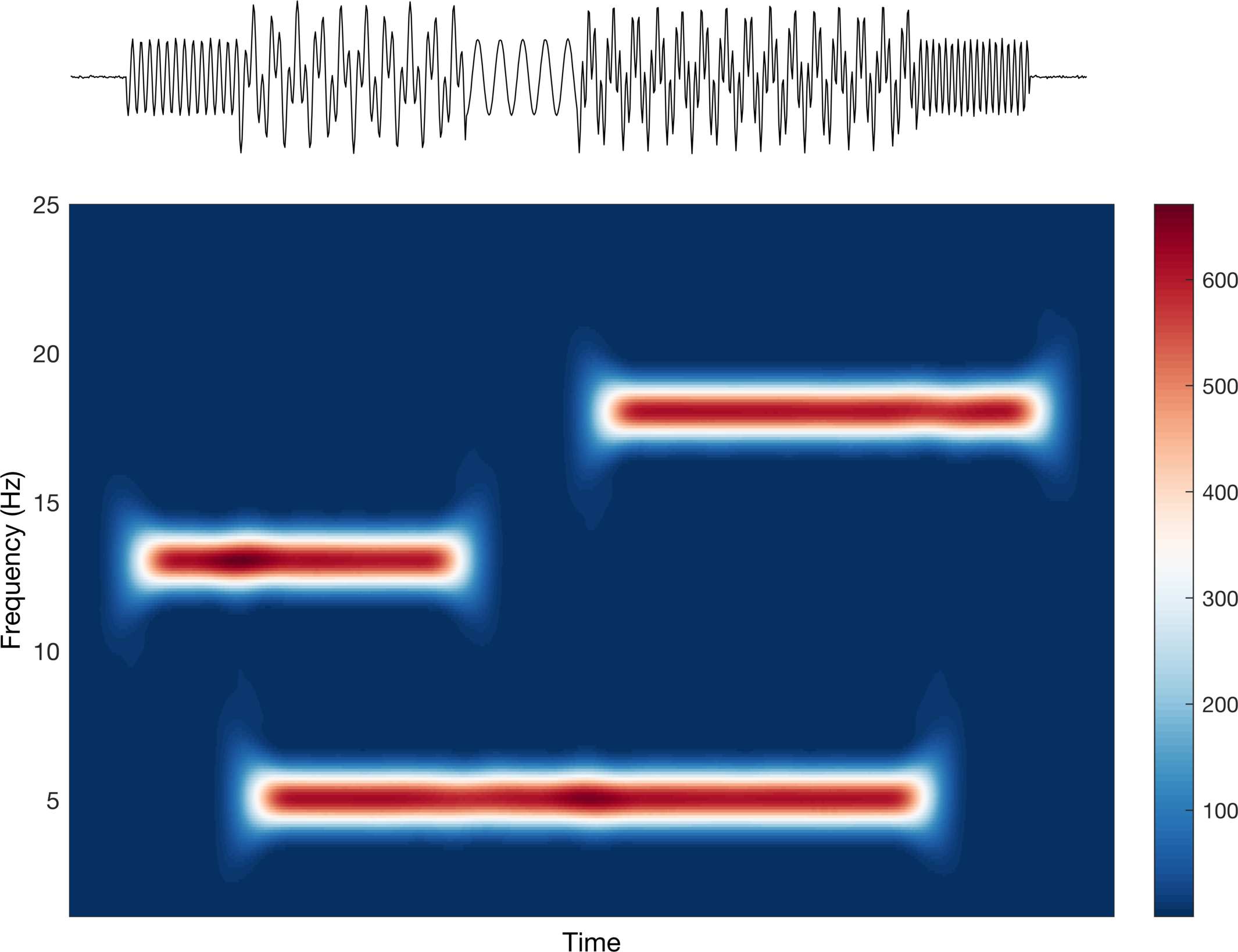
This looks good, but is it saying what we want it to say? Well, this implies that the data increase (red) and decrease (blue) around some center point (white). Clearly the scale bar on the right tells us that this is not what is happening. They are increasing sequentially from 0 (don’t worry too much about the actual values, just the trend). Let’s change this to a sequential colormap and check again.
%% Change color - using sequential from before
colorscale = cbrewer('seq','Oranges',100);
colorscale(colorscale < 0) = 0; % bug: sometimes produces (-) values so set to 0
ax2.Colormap = colorscale;
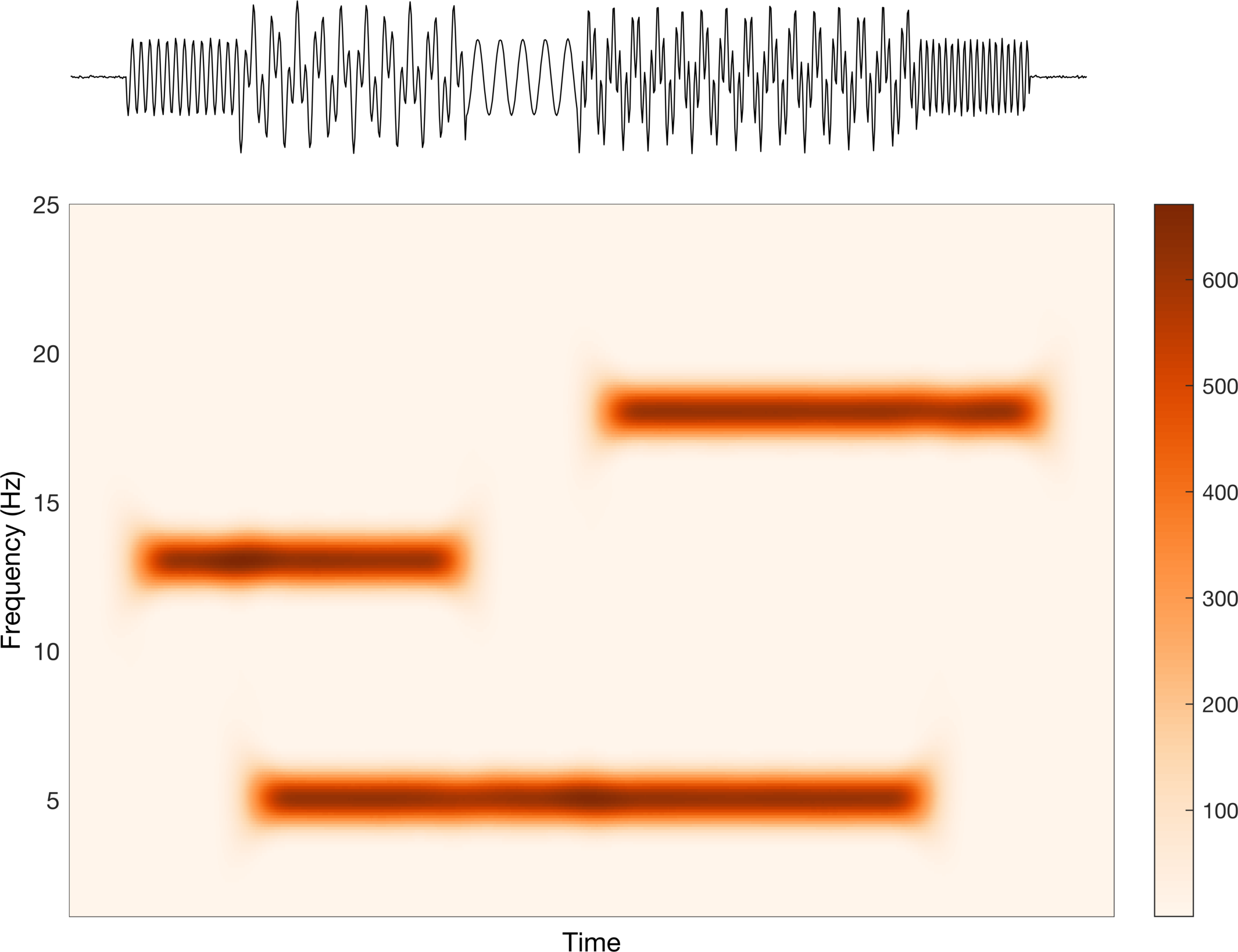
Alright, this looks better. The color increases sequentially from light to dark, which matches the trend in the scale bar, i.e. the data go from small to large. In a perfect world, we would only have two values: none and some. Due to computational inaccuracies, spectral leakage, etc. we have some error around our estimation, which corresponds to the values in between none and some.
Sometimes we do want to represent changes such as increase and decrease when looking at frequency content in neural signals. We will see a more concrete example in actual EEG later in this post, but for now we can use our toy data. To see how this works, we will subtract the average of each frequency across time from itself.
%% Rescale data by subtracting mean across time
% This is known as an ERSP (event related spectral perturbation) in EEG
% analysis. Normally computed in log scale
ERSP     = abs(tfmap).^2 - mean((abs(tfmap).^2),2);
ss.CData = ERSP;

% Update colorbar
minVal    = min(ERSP(:));
maxVal    = max(ERSP(:));
cc.Limits = [minVal maxVal];

% Change back to divergent color scale
colorscale = flipud(cbrewer('div','RdBu',100));
colorscale(colorscale < 0) = 0;
ax2.Colormap = colorscale;
This is a rather contrived example, and to be honest, what we just did makes no sense for these specific signals, but it should make the point more clear. The average values is somewhere between none and some and thus when there is no signal we see negative values, and when there is signal we see positive values. The last point I want to make here is about cases in which our maximum increase and maximum decrease are not symmetric around the average value.
%% What if the (+) and (-) values werent quite symmetric?
ERSP2         = ERSP;
ERSP2(ERSP<0) = ERSP(ERSP<0)*0.5;
ss.CData      = ERSP2;

% Update colorbar
minVal2   = min(ERSP2(:));
maxVal2   = max(ERSP2(:));
cc.Limits = [minVal2 maxVal2];
Here we can see that the color still diverges around 0, but now the scale bar goes from a smaller negative to much larger positive value. This is reflected in the intensity of the colors.
I know these previous examples are super contrived, but the take away should be clear: the colors you choose and their scaling will impact what your figures say about your data. Let’s move on and play with some real data..
Real data (adapted from Mike X Cohen’s tutorial on EEG time-frequency analysis)
Now we will use some real EEG data to further illustrate this point. We will begin by loading the data and computing the wavelet transform. For the sake of space, I am not including the code for that here, but you can find it in the code for this post or from Mike’s tutorial. Instead, I am going to focus on the plots. I am still using his code, but I am making some changes to the visualization, which are (mostly) marked by JB EDIT.
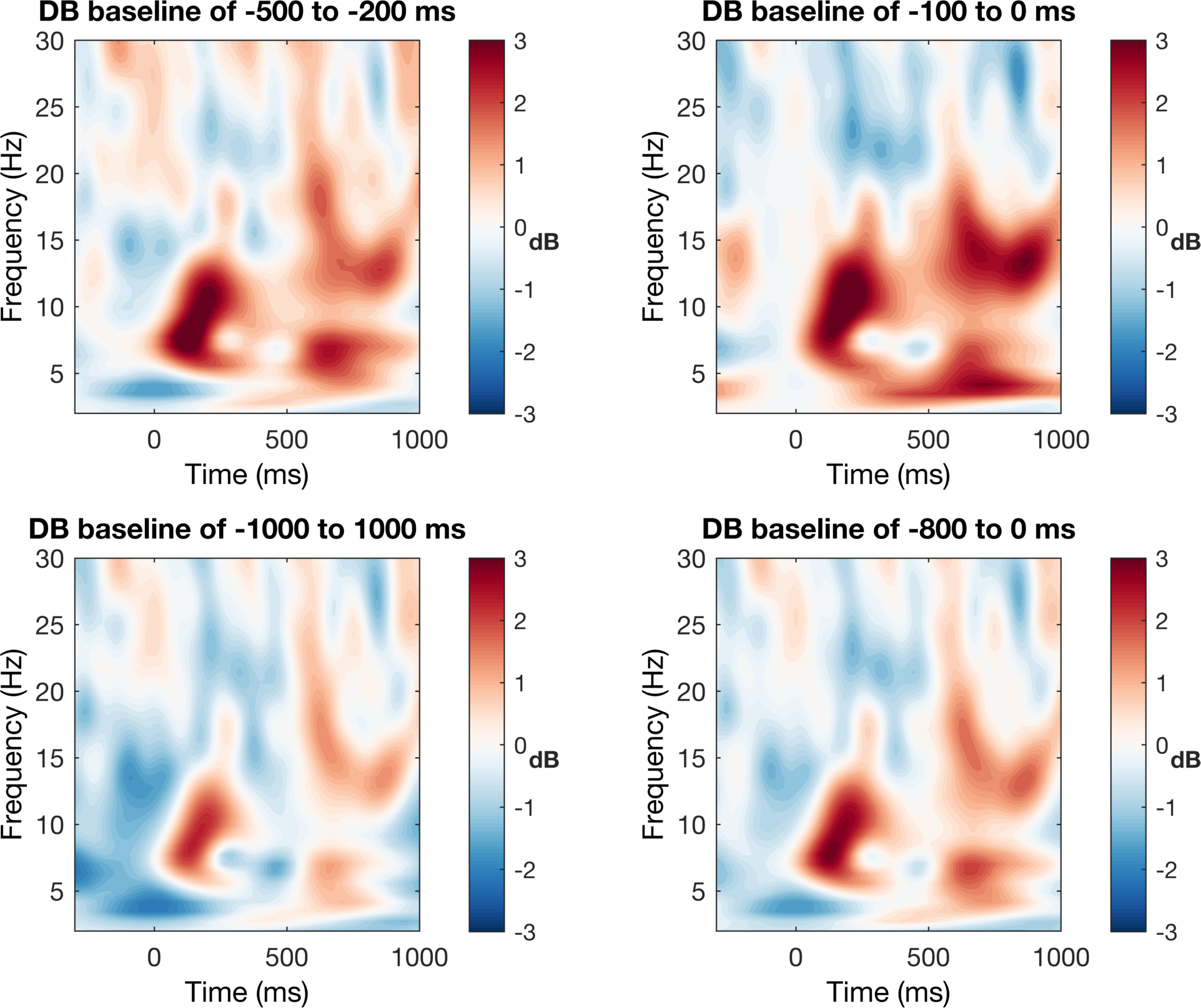
We will first plot the time-frequency with no control for scaling or colors. In his code, Mike shows baseline normalization using percent change from the mean and change in dB (log scale) from the mean. We will just stick with the
%% plot results - no control for color limits
for basei=1:size(baseline_windows,1)

    % first plot dB
    figure(1), subplot(2,2,basei)
    contourf(EEG.times,frex,squeeze(tf(basei,:,:)),40,'linecolor','none')

    % JB EDIT:
    %set(gca,'clim',climdb,'ydir','normal','xlim',[-300 1000])
    set(gca,'ydir','normal','xlim',[-300 1000])
    cbar = colorbar; % auto colors
    cbar.Label.String = 'dB';
    cbar.Label.Rotation = 0;
    cbar.Label.FontWeight = 'b';
    set(gcf,'color','w');
    % end JB EDIT

    title([ 'DB baseline of ' num2str(baseline_windows(basei,1)) ' to ' num2str(baseline_windows(basei,2)) ' ms' ])
    xlabel('Time (ms)'), ylabel('Frequency (Hz)')
end
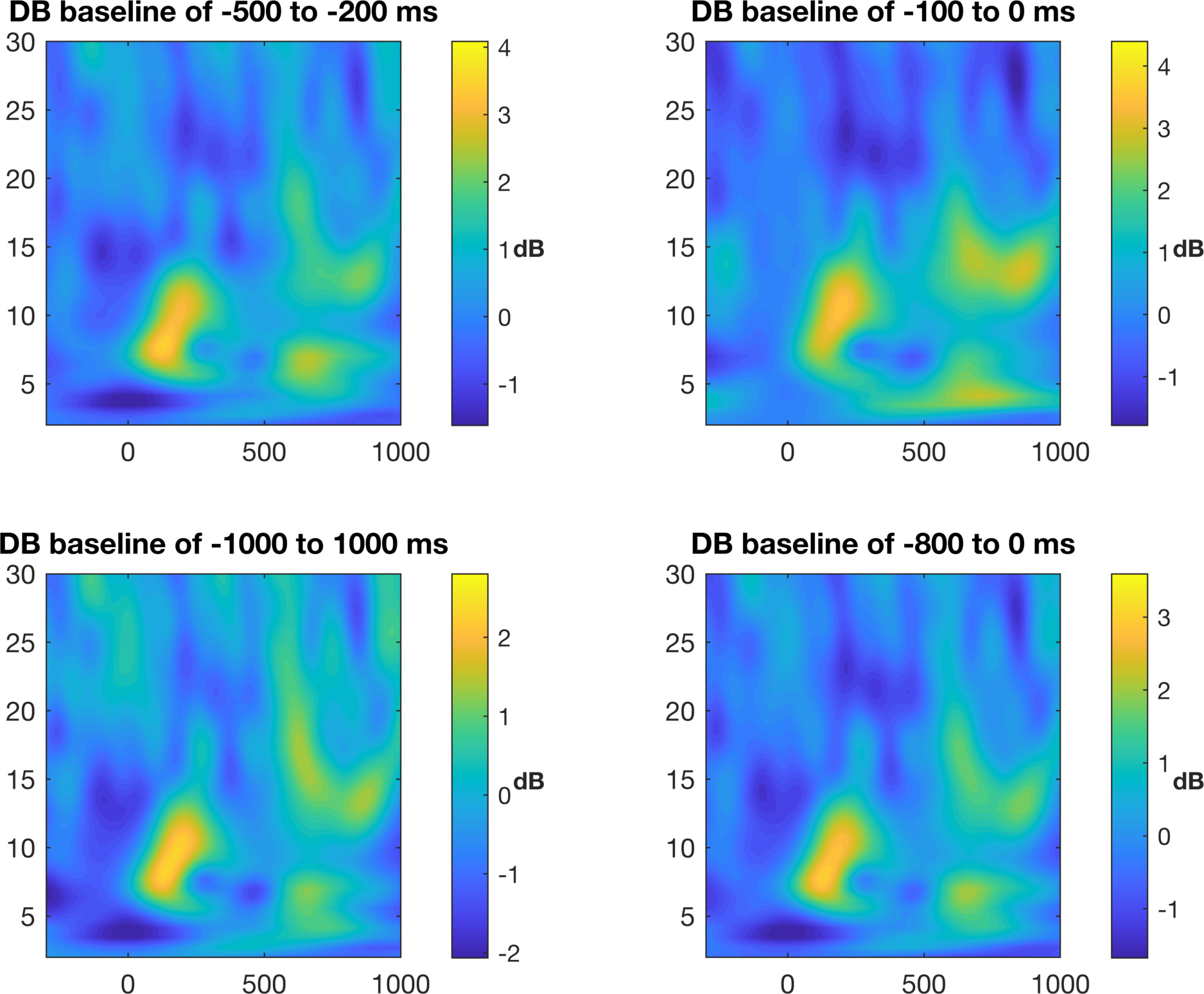
This is not a terrible figure, but as it is now, it can be quite misleading based on the colors. To our eyes, we see that the light and dark colors are apparently symmetric around some center value, but in reality, the data do not reflect this pattern. Look at where zero is and you will see that it is not in the middle. In order to be fair, we need to make the color bar symmetric around zero with the equal magnitude maximum and minimum values.
%% plot results - now control for color limits

% define color limits
climdb  = [-3 3];

for basei=1:size(baseline_windows,1)

    % first plot dB
    figure(3), subplot(2,2,basei)
    contourf(EEG.times,frex,squeeze(tf(basei,:,:)),40,'linecolor','none')
    set(gca,'clim',climdb,'ydir','normal','xlim',[-300 1000])

    % JB EDIT:
    cbar = colorbar;
    cbar.Label.String = 'dB';
    cbar.Label.Rotation = 0;
    cbar.Label.FontWeight = 'b';
    set(gcf,'color','w');
    % end JB EDIT

    title([ 'DB baseline of ' num2str(baseline_windows(basei,1)) ' to ' num2str(baseline_windows(basei,2)) ' ms' ])
    xlabel('Time (ms)'), ylabel('Frequency (Hz)')

end
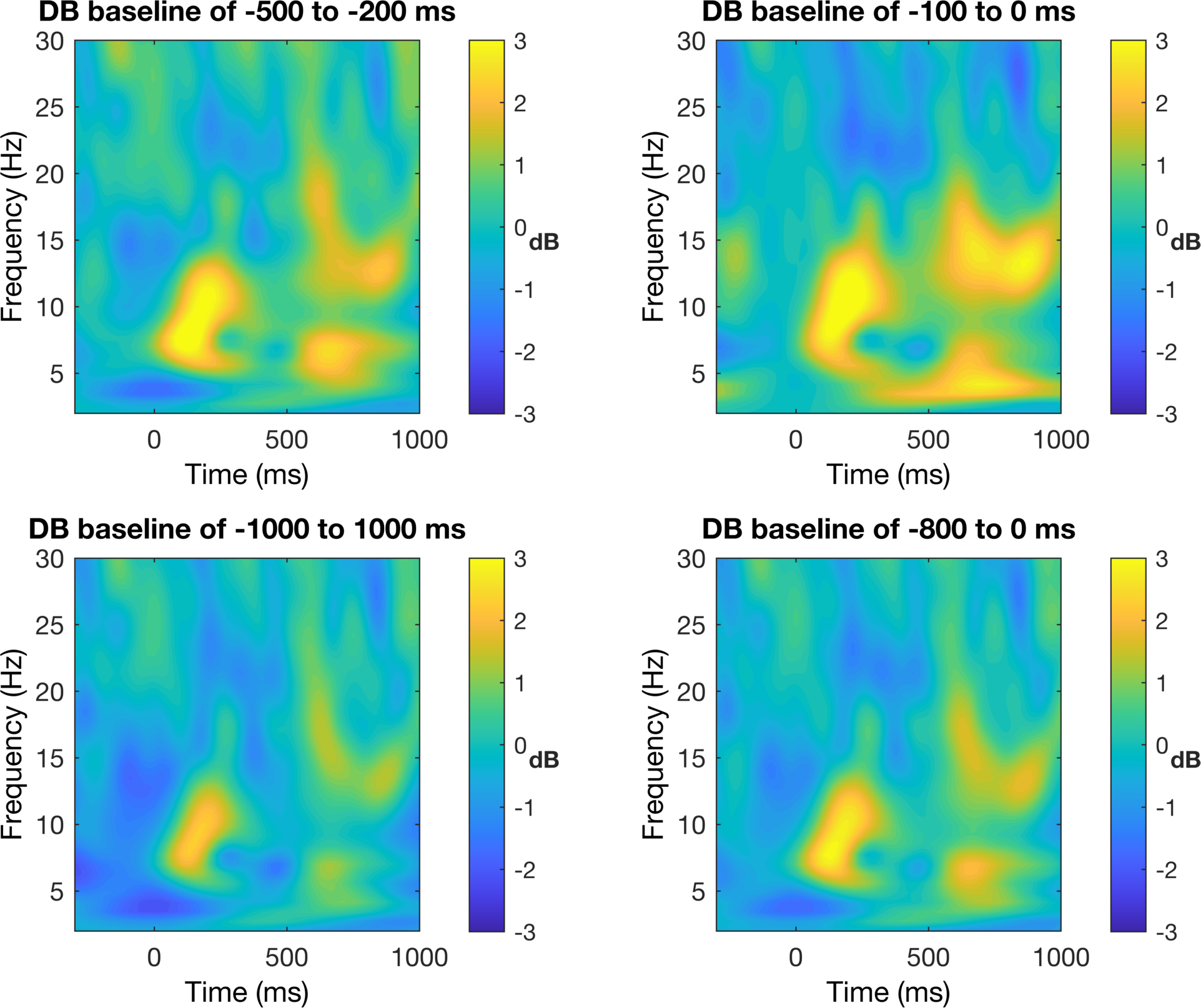
Now we can see that the increases are much larger in magnitude than the decreases around the center value. This is not to say that the first EEG figure without color control is wrong per se, but it is certainly misleading (although I would consider this to be wrong when you consider good scientific practices). So now the color scaling looks better, but the colors themselves are also not my preference. Not that the colors are bad, but we are only trying to show changes in two directions (increase and decrease) and thus we prefer a diverging color map with only two colors.
% JB EDIT:
colorscale = flipud(cbrewer('div','RdBu',100));
colorscale(colorscale < 0) = 0;

for basei=1:size(baseline_windows,1)

    % first plot dB
    figure(5), subplot(2,2,basei)
    contourf(EEG.times,frex,squeeze(tf(basei,:,:)),40,'linecolor','none')
    set(gca,'clim',climdb,'ydir','normal','xlim',[-300 1000])

    % JB EDIT:
    colormap(colorscale);
    cbar = colorbar;
    cbar.Label.String = 'dB';
    cbar.Label.Rotation = 0;
    cbar.Label.FontWeight = 'b';
    set(gcf,'color','w');
    % end JB EDIT

    title([ 'DB baseline of ' num2str(baseline_windows(basei,1)) ' to ' num2str(baseline_windows(basei,2)) ' ms' ])
    xlabel('Time (ms)'), ylabel('Frequency (Hz)')

end
Great! This figure now show what we want it to show. We can clearly see the increases and decreaes in power around the mean and the colors accurately correspond to their magnitude with white being zero change. I think this is a much better representation of the data than before, but just to be fancy, let’s do a few more things to clean it up. This is not the cleanest code but it does the job.
%% Finalize plot - JB edited

fig = figure('color','w');
ax = tight_subplot(2,2,[.05 .05],[.1 .1],[.1 .15]);
colorscale = flipud(cbrewer('div','RdBu',100));
colorscale(colorscale<0) = 0

for basei=1:size(baseline_windows,1)

    % first plot dB
    axes(ax(basei));
    box on;
    contourf(EEG.times,frex,squeeze(tf(basei,:,:)),40,'linecolor','none')
    set(gca,'clim',climdb,'ydir','normal','xlim',[-300 1000],'fontsize',9)

    % Add line to show show stimulus
    line([0 0],[min_freq max_freq],'color',0.5.*ones(3,1),'linestyle','--')

    % Add title to show baseline norm period
    title([ num2str(baseline_windows(basei,1)) ' to ' num2str(baseline_windows(basei,2)) ' ms' ])

    if basei < size(baseline_windows,1)-1
       ax(basei).XTickLabel = [];
    else
       ax(basei).XLabel.String = 'Time (ms)';
       ax(basei).XLabel.FontWeight = 'b';
    end

end

% Add title
ax_title                  = axes('position',[.4 .9 .2 .05]);
ax_title.Title.String     = 'This Figure Explains Baseline Normalization in dB';
ax_title.Title.FontWeight = 'b';
ax_title.Title.FontSize   = 12;
ax_title.Color            = 'none';
ax_title.XColor           = 'none';
ax_title.YColor           = 'none';

% Change labels
ax(1).YLabel.String     = 'Frequency (Hz)';
ax(1).YLabel.FontWeight = 'b';
ax(3).YLabel.String     = 'Frequency (Hz)';
ax(3).YLabel.FontWeight = 'b';
ax(2).YTickLabels       = [];
ax(4).YTickLabels       = [];

% Add colorbar
ax_cbar                = axes('position',[.85 .1 .01 .8]);
ax_cbar.FontSize       = 9;
ax_cbar.XColor         = 'none';
ax_cbar.YColor.        = 'none';
colormap(colorscale);
cbar                   = colorbar;
cbar.Limits            = climdb;
ax_cbar.CLim           = climdb;
cbar.Position(3)       = .025;
cbar.Label.String      = '(dB)';
cbar.Label.Rotation    = 0;
cbar.Label.FontWeight  = 'b';
cbar.Label.FontSize    = 9;
cbar.Label.Position(1) = 3.5;
set(gcf,'color','w');
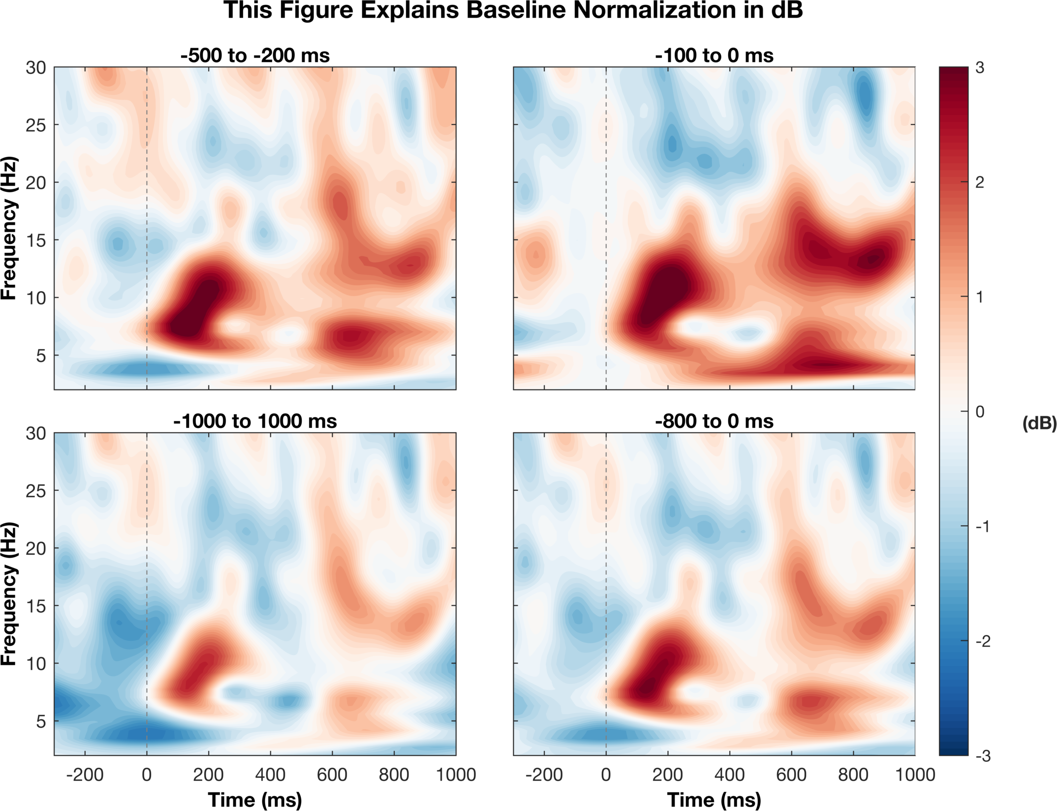
There are a couple of things here that I think make the figure better. For one, we can see when the stimulus occured so we have a reference point for the changes in activity. Two, we annoted the figure to explain the time window being used for baseline normalization. I did not mention either of these things before, but I wanted to include it to make a finalized verion of the figure. Third, since they all have the same x and y axes, we moved their labels to the outside to avoid clutter. Finally, we scaled all figures to the same scale so we can compare them family and we now have a single scale bar for reference. Many of these things are just style choices but I think they help with making the figure presentable.
Closing thoughts
I hope this post helped demonstrate how color scaling can influence the representation of the data. Some of the main points are that we should choose the color map type (sequential, divergent, or qualitative) based on how the data are referenced. Second, we want the colors to scale in a way that is fair, so in this case, we made the values symmetric around zero.
Next time..
In the next (and final) post of this series, I will go through another example using EEG. We will look at event-related data from many channels and plot them on 2D representation of the head. It will also show how we can hack existing functions to get the results we want.