
Making Nice Figures (in MATLAB) - Part 1
Published:
I was recently invited to participate in a workshop for visiting Research Experience for Undergraduates (REU) students at the University of Houston’s REU site. This is the first of a few posts outlining my presentation on making nice figures.
In any normal summer, talented and ambitious REU students gleefuly show up at the University, ready to embark on their summer research experience. They will spend the next 12 weeks in a research lab full of graduate students and postdocs who, under normal circumstances, have yet to discover it is summer break. In some labs, a student will show up and a project is sitting there ready for them to tackle. In other labs, graduate students and postdocs sit down with the student and try to identify a project for the next few months. In all cases, its an incredibly overwhelming experience where you are not only learning about your research project, but you are learning about what it means just to do research.
Due to the COVID-19 pandemic, the REU summer internship (still ongoing as of this post) is now limited to an online research experience. As part of the training at the UH REU site, the group of fifty or so students is expected participate in a regularly-scheduled workshop covering topics on research practices, signal processing, machine learning, and a handful of more advanced topics in signal processing (with a primary focus being on neural signals, especially EEG). When consdering what topic I was going to present, I tried to think back to some of the essential skills I would have appreciated learning earlier on in my research career. Often times, one of the most challenging things you encounter when you first embark on a research journey is not the actual project itself, but learning how to explain what you did and exactly how you did it. One of the most important facets of great scientific story telling is the illustrations, or figures, you use to convey the message in your data (or theory). I am definitely not an expert in figure design or scientific visualization. However, I do care about the interpretability and aesthetics of my figures, and I try to put a lot of effort into maximizing both. While I am still young in my career, I consider myself enough of a veteran in research to know the aches and pains that come with the bumpy (but exhilerating!) ride.
I want to point the reader to a nice paper, entitled Ten Simple Rules for Better Figures. Instead of starting from scratch, I tried to draw on a lot of other great resources that ouline principles in figure design. In particular, I lean heavily on the paper Ten Simple Rules for Better Figures to guide the discussion, since they already did a lot of the heavy lifting. Some of the points are perhaps a little less important for the budding scientists who are still new to research altogether, but they are all important to keep in the back of the mind when developing a figure for presenting your work. This paper is not so much about the details of how to make figures in any particular environment, but some general principles that guide the process. The MATLAB tutorials in the following posts were designed to illustrate a handful of these points in detail and provide guidance on the how aspect of figure making. I have to admit, I am working to transition 100% of my work to python and other open-source data analysis languagues, but when I started my Ph.D., MATLAB was still the go-to for neural data analysis.
Summarizing Ten Simple Rules for Better Figures
In Ten Simple Rules for Better Figures, the authors outline ten points that help guide figure design and, hopefully, result in more informative and compelling figures for explaining your work. Here are the rules:
- Know Your Audience
- Identify Your Message
- Adapt the Figure to Support Medium
- Captions Are Not Optional
- Do Not Trust the Defaults
- Use Color Effectively
- Do Not Mislead the Reader
- Avoid “Chartjunk”
- Message Trumps Beauty
- Get the Right Tool
I am not going to go through each point individually. Instead, I urge you to read the paper and then come back if you want to follow along with the MATLAB examples. We will touch on each in some way in the examples. Before we go on, however, I do at least want to point to some useful resources related to a few of these points.
Adapt the Figure to Support Medium
While the paper tends to talk about adapting a figure’s content to the medium (and this is a good point), an often overlooked point is adapting the figure to maintain the overall readability. For example, if I export a figure to fit in an article written on standard letter paper, there is no guarantee this will scale properly if I want to put it on a scientific poster or in slides for an oral presentation. We need to make sure we consider that all fonts scale properly and that the resolution remains high enough so that the image is not pixelated when we enlarge it. One invaluable tool I have found for managing this in MATLAB is the export_fig function. It operates as a wrapper around the print function, but helps to keep your figure exactly as you have it rendered on screen. Check out the github page for more information and to download. I’ll show an example of how this is used in the following post.
Do Not Trust the Defaults
When I first started trying to find resources on how to “beautify” figures beyond the defaults, I discovered the post, Making Pretty Graphs, on Loren Shure’s blog, Loren on the Art of MATLAB. Through a series of adjustments to the figure, she shows how to take your figures from drab…
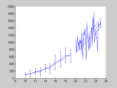
…to fab!

Now, I know everyone has their own taste when it comes to aesthetics, but there is no doubt that the figure on the top (drab) is just completely uninformative and does a poor job at conveying the message (it saddens me to say that I have seen figures in slides that look like this!). This is what happens when the extent of your code looks like this:
load data.mat
plot(x,y);
The data in this example are completely made-up, but just from looking at the figure on the bottom (fab!), I can see that whatever was measured, there is a clear relationship between length and mass, and there is more variance in the mass as the length increaes. Furthermore, I can see that a third order polynomial appears to fit the data, but a fair number of observations fall outside of our 95% confidence interval. Great! Without any context of what was being observed, I can still come up with a decent explanation of what is happening in the data. The examples in the following tutorials will dive much deeper into what we can do to substantially improve on the defaults.
Use Color Effectively
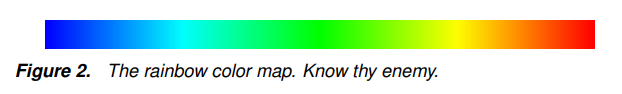
Let me start with a figure from Why We Use Bad Color Maps and What You Can Do About It, written by Kenneth Moreland at Sandia National Labs in Albuquerque, NM (my beloved hometown!), to give you a little flavor of what the rest of the section on color is going to be like!
I am definitely not the only one to express animosity towards this type of colormap. In addition to the paper above, there are a number of additional great resources on the topic:
- Another paper by Kenneth Moreland on Diverging Color Maps for Scientific Visualization
- A paper by Borkin et al. that demonstrates how “the rainbow colormap can signficantly reduce a person’s accuracy and efficiency” when using color graded visualizations for diagnosing coronary heart disease.
- A nice presentation by Kristen Thyng on Perceptual Color Maps in matplotlib for Oceanography (although the principles still apply quite generally).
- Matt Hall’s blog post, No More Rainbows!, gives some nice examples of various colormaps and lists some additional papers/posts on the topic.
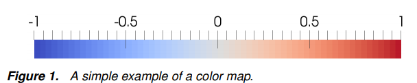
Know thy enemy. Now, I know alot of people feel either indifferent about this color scheme or outright defend the rainbow color map. In fact, there have been some nice solutions to using a similar color map called turbofor those that feel so compelled to use a rainbow scheme. However, the more fundamental question is not simply about how it looks, but rather what it does to convey the information in the figure. What then would be a reasonable alternative to the rainbow if we wanted to show data from two extremes, such as hot/cold, increase/decrease, etc.?
In general, we can use color maps to show three different things: sequential values (think 0-100%), diverenging values (hot to cold), and categorical data (fruits: apple, orange, banana,…).
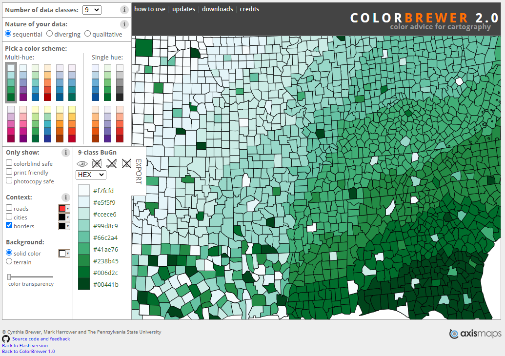
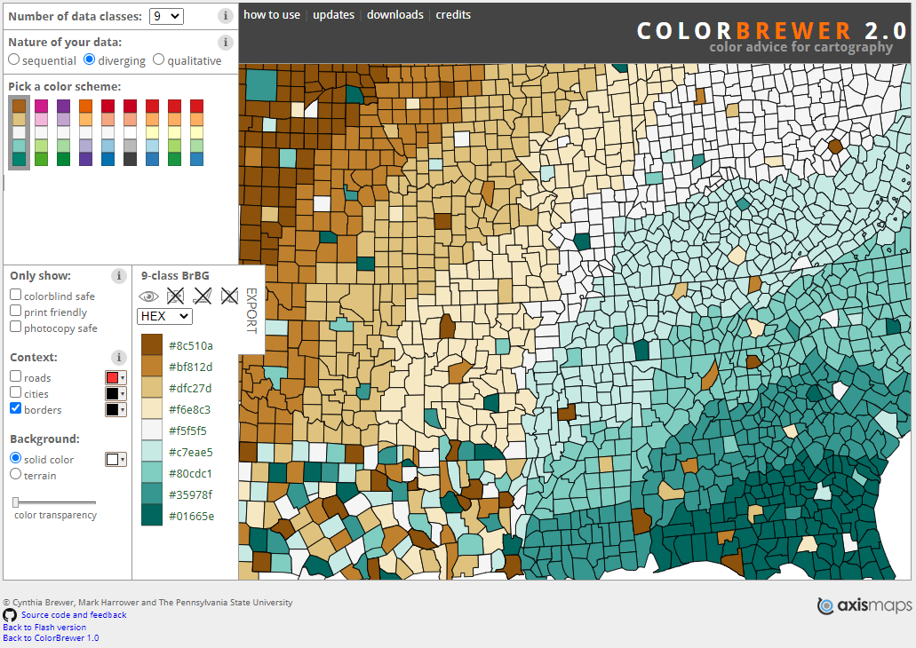
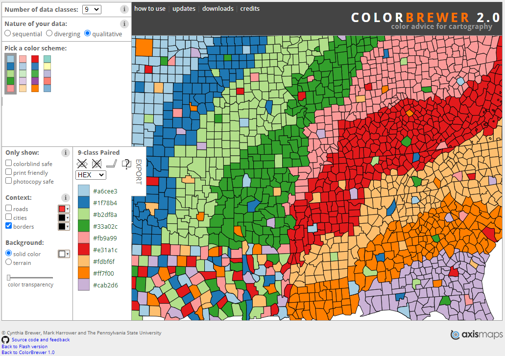
These are all examples from colorbrewer showing sequential (left), diverging (center), and categorical or qualitative (right) color maps. The choice of colormap can not only impact the aesthetics, but also how and if you properly convey the message being presented in the figure.
Next time
In the next few posts I will be going through three examples of making plots using electroencephalograpy (EEG) data from my PhD work. The idea will be that through these examples, I can highlight most of the points listed above.